Confluence Mobile
Designing an AI-powered companion for work
This content requires a password to view
Product Strategy | AI Design | Concept Development
Client: Atlassian (Confluence Mobile)
Problem: Confluence Mobile wasn't set up as a helpful companion to desktop. Reaching for it meant combing through endless lists of content and notifications—all sorted by time, with no indication of what was important. We were missing the opportunity to help people get in, get things done quickly, and leave with confidence.
Goal: Shift mobile from "here's what's recent" to "here's what matters now and why"—so users can see, act, and move on with confidence.
Role: Senior Product Designer (embedded). Led discovery and concept development across core “work triage” surfaces—content lists, notifications, and AI-native mobile experiences.
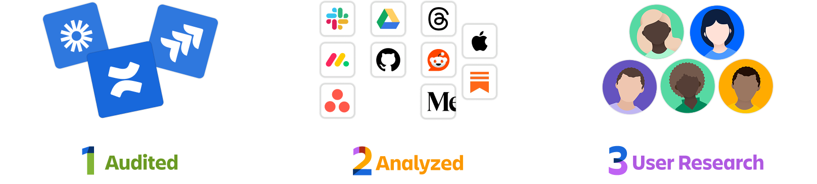
Approach: Audited Confluence and Jira mobile surfaces, analyzed 10+ competitor apps, synthesized existing and new user research, developed UI and AI design principles, then concepted across four surfaces—from foundational list improvements to forward-looking AI experiences.
Outcome: The research and concepts gave the team a clear, grounded direction for Confluence Mobile's future. The two primary concepts—smarter lists/notifications and Focus—are now the foundation for designs slated for development. The work is being referenced by PMs, designers, and adjacent teams including Jira as they shape their own mobile strategy.
Confluence Mobile is Atlassian’s app for staying connected to work on the go. But the experience had been designed as a compressed version of desktop — not as a companion to it. Users came to mobile for quick orientation and triage, and the app wasn’t built for that.
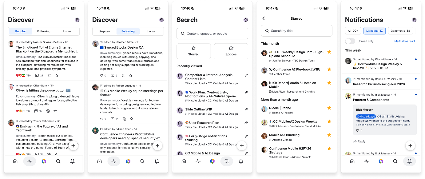
The experience was also working against itself. Notifications were generic, content was sorted by recency, and almost everything was represented the same way — flat lists with no indication of priority or meaning. With average sessions under two minutes, users didn’t have time to figure out what actually mattered.
What made this hard
Everything looked equally important — flat, time-sorted lists gave no signal about what needed attention
Too many actions per item created cognitive load before users even understood what they were looking at
Intent was hidden — “resume what you were working on” and “respond to something urgent” used identical patterns
Mobile was treated like a smaller desktop instead of a different kind of tool
43% of users had disabled notifications due to overload — disengaging rather than managing the noise
Strategic framing
The core shift was from “what’s recent” to “what matters now and why.” Rather than asking users to scan and interpret everything themselves, we designed around Atlassian’s AI (Rovo) as a thinking partner — one that could infer importance, explain why something needs attention, and help users leave a session confident nothing critical was missed.
Content was grouped by intent rather than time: things that need a decision now versus things to prepare for. And rather than fighting the two-minute session constraint, we treated it as a design principle — every item should be understood in 15 seconds and actionable in under a minute.
Discovery & Audit
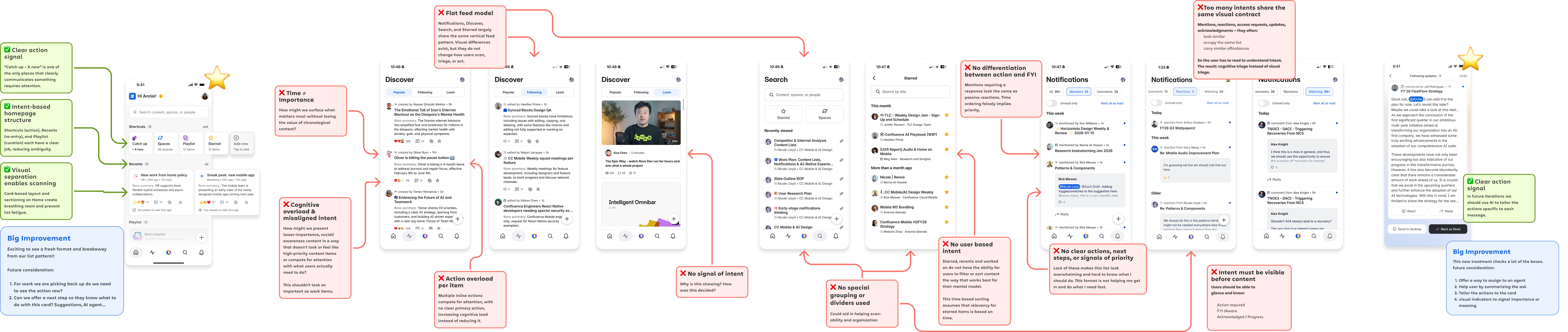
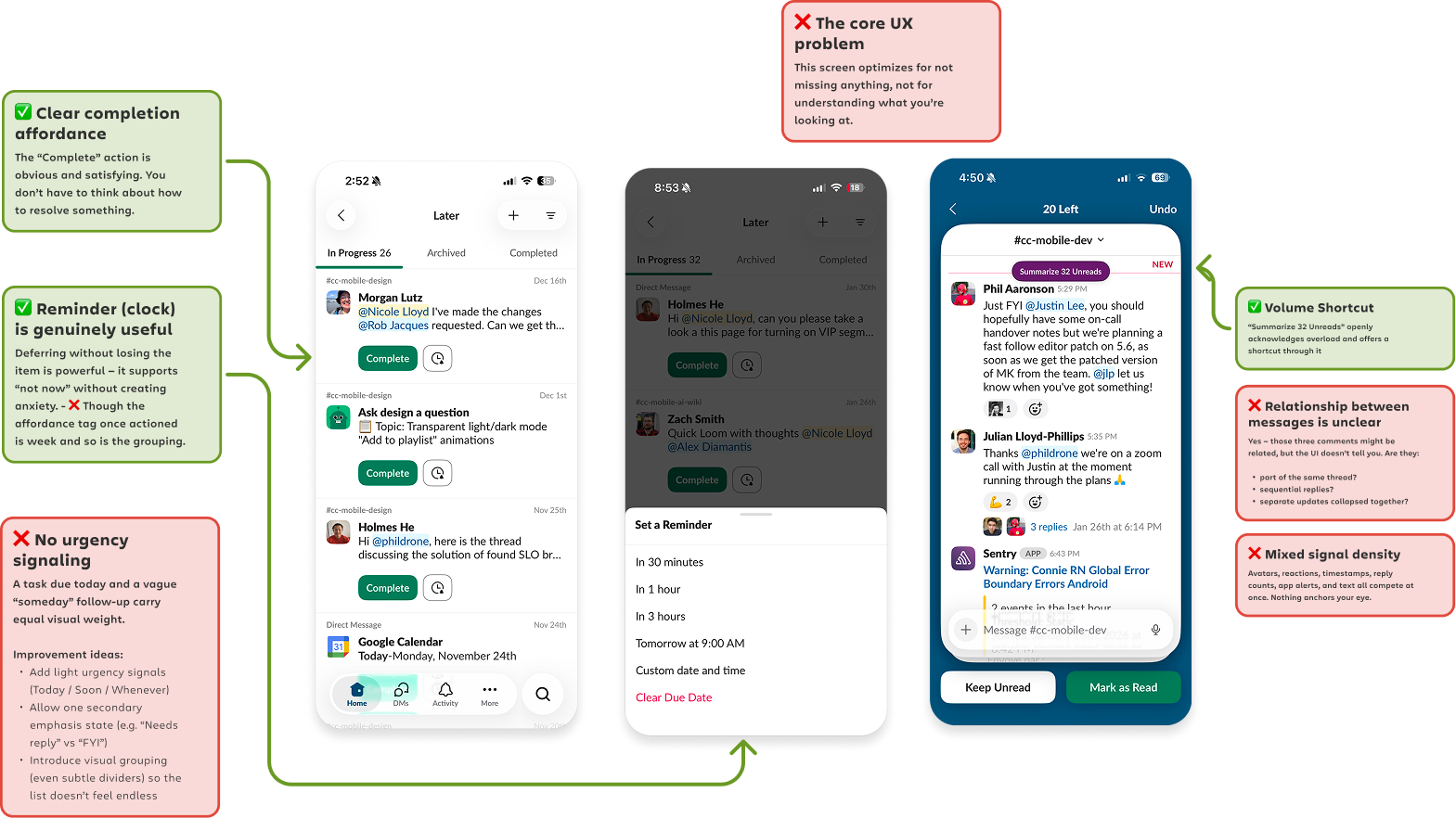
We audited Confluence and Jira mobile to understand how each app helps users orient and take action. Confluence Home showed stronger intent-based structure, but content lists and notifications still felt flat and noisy. Jira had better scannability and status signaling, but neither app consistently answered the question users actually needed answered: what matters right now, and why?

Competitive Analysis
We analyzed 10+ apps across productivity tools, consumer apps, and AI-native products to understand how they surface priority and meaning.
Key takeaways
Intent-based sections help users understand why they are looking at something.
Clear visual hierarchy helps users scan without reading everything.
Time does not equal priority. Uniform UI makes everything feel equally urgent.
Fewer actions per item reduces cognitive load.
Density controls and spacing give users more control.
User Research
We synthesized existing research and conducted new interviews to understand how people use mobile during the workday (orientation, triage, and small actions—rarely deep work). Users consistently described four key jobs:
1. Quickly understand what changed and why it matters now.
2. See what involves them — mentions, requests, assigned work, and blockers.
3. Decide fast — do it now or save it for later.
4. Take small actions without opening multiple apps.
A core frustration kept surfacing: “I always worry that I’m going to dismiss a notification and then forget about something.” Users wanted to stay connected but felt overwhelmed, so they disengaged entirely—43% had disabled alerts due to fatigue.
Representative signals users relied on (and we designed to amplify):
“Is this waiting on me?” (mentions, approvals/requests, assigned work)
“Is there a deadline or meeting coming up?” (time sensitivity)
“Is this blocking someone else?” (dependencies / blockers)
“What changed, and what’s the next step?” (context + intent)
Design Principles
Rather than jumping straight to concepts, we used the research to define a set of principles that would guide decisions across every surface.
UI principles focused on structure (group by intent, order by importance, break up flat lists), visual hierarchy (breathing room, strategic dividers, visual indicators), and interaction (plain language, limited actions per item).
AI principles focused on what to surface (summarize what changed, filter for relevance, highlight why items matter), what users can do (inline actions, quick handoffs, one-tap flows), and how to present it (digest cards, summary-first recaps, skimmable mobile-friendly formats).

Concept Directions
The research informed concepts across multiple surfaces — from foundational improvements to forward-looking AI experiences. Each addressed a different facet of the core problem: helping users see what matters and act with confidence.
1. Signal over Noise — Smarter Lists & Notifications
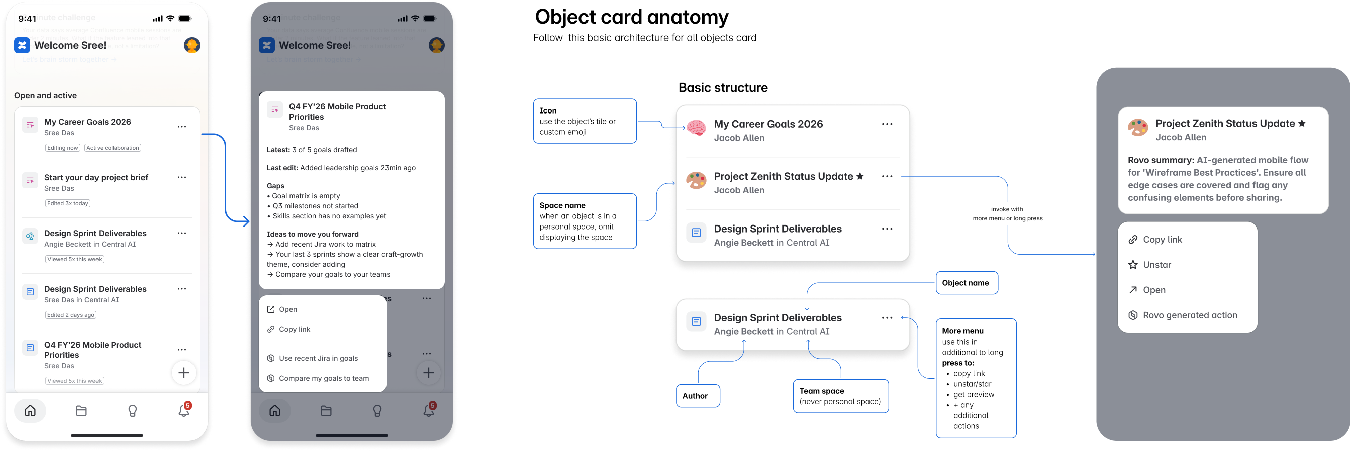
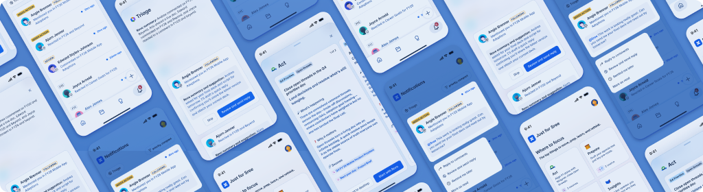
The foundational direction. Every content surface in the app had the same problem: flat lists, sorted by time, with no indication of what actually needed attention. Notifications sorted by type, not intent — a page mention, a "thank you" reaction, and an urgent blocker all looked identical.
The shift was from high cognitive load, unranked lists → grouped by priority, easy to scan, with enough context to decide what to open and what to skip.
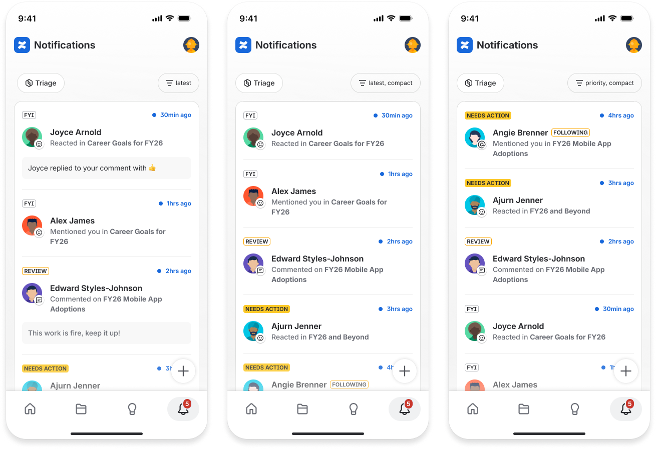
Key decisions:
Use labels, icons, and visual hierarchy to surface type, intent, and “action needed” at a glance
Limit visible actions to one or two per row — long-press and filters handle the rest
Group by relevance to right-now work: continue, recently changed, needs your input
Use Rovo to infer importance using signals like ownership, mentions, time sensitivity, and dependency risk — and make the reasoning visible so users can trust or override it
Rovo Assist takes this further: invoke it directly from notifications to open a triage flow — get a summary, see smart suggestions, and confirm individually or in bulk. A fast way to feel caught up without reading everything.
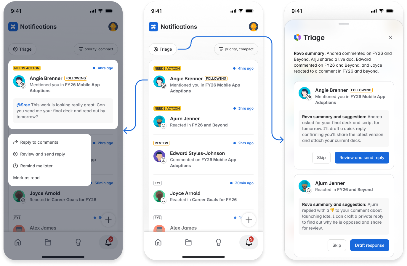
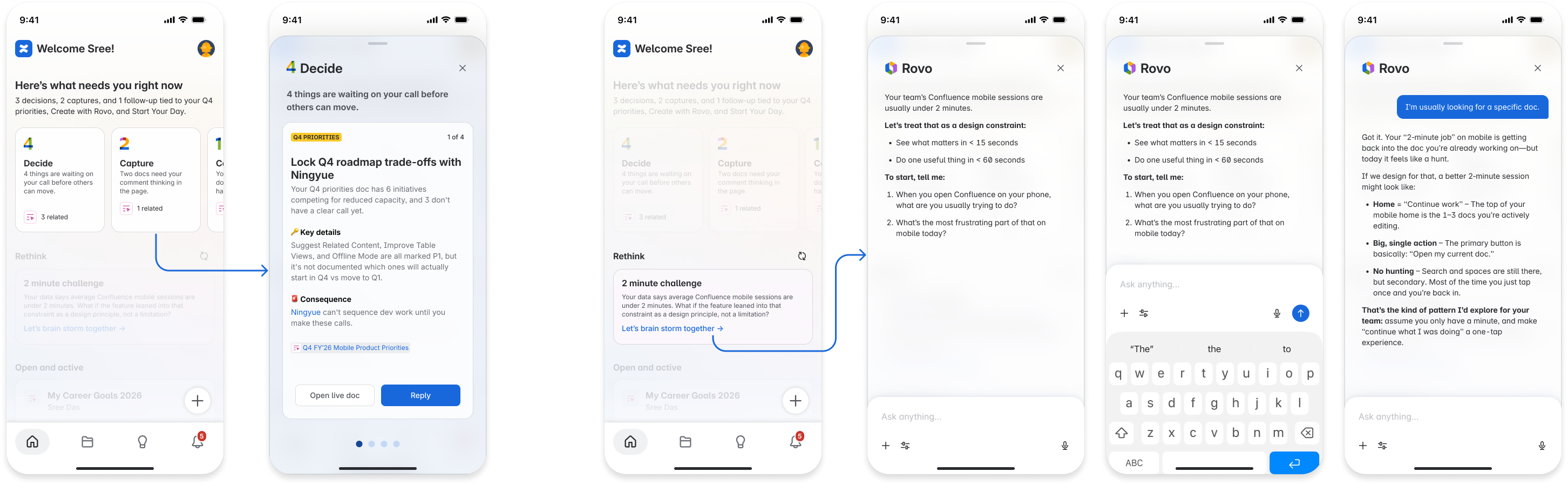
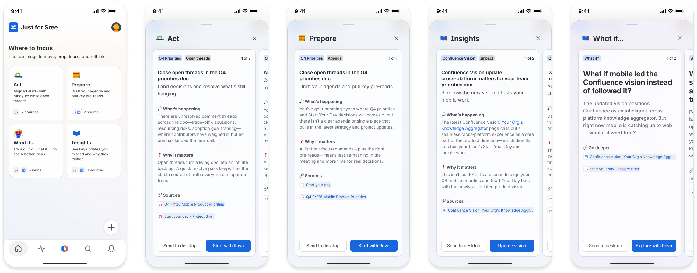
2. AI-Powered Assistance — Focus / Start Your Day
The most forward-looking direction. An AI-curated briefing that shifts mobile from “here’s what’s recent” to “here’s what matters now and why.”
Rovo looks across pages, comments, mentions, and projects to surface the handful of items that actually need your attention — decisions to make, loops to close, thinking to capture — in under two minutes.
Every item had to pass a simple test:
1. Could a notification already tell you this? If it’s just “something happened,” it stays in notifications.
2. Does it change what you should do today? If it doesn’t create a decision or next step, leave it out.
3. Is there a consequence if you miss it? If nothing gets blocked or delayed, it’s not Focus material.
The clearest way to describe the difference: notifications tell you what happened. Focus tells you what it means.
Iterations: Round 1 explored three separate concepts — Home Right Now (grouped into Decide / Capture / Complete), Rethink (prompts that challenge assumptions), and Open and Active (your current workbench). Round 2 consolidated: “Right Now” language was dropped, Rethink folded into the primary concept as “What if...” prompts, Open and Active paused for V1, and grouping evolved from Decide/Capture/Complete to Act (things waiting on your call) and Prepare (work to get ready for).
Two additional surfaces were concepted but scoped to a later phase:
Starred / Your Stuff — Turn Starred from a chronological bookmark list into a “what matters to me” hub, with smarter sorting and signals that let stale items fade gracefully
AI-Powered Library — A predictable “find X” starting point, keeping Home focused on “continue Y” — with AI-tuned views that filter and sort around what you care about
Both were deprioritized for V1 to keep the core concept focused, but included in handoff materials as clear next directions.
The discovery and concepts generated strong excitement from the PM and design team. Though the engagement ended before handoff, the research and concepts were picked up directly by the team and used to move the Confluence Mobile roadmap forward.
Learnings
Chronological sorting is a design default, not a user need — breaking away from “newest first” required a strong case, but unlocked clearer thinking about intent
AI works best when it builds confidence rather than replaces judgment — “here’s what this means” is more useful than “here’s what to do”
Designing for a constraint (2-minute sessions) sharpens decisions faster than designing for an ideal state
Foundational design principles — hierarchy, spacing, visual differentiation — do heavy lifting when content types have different jobs
Establishing shared principles early made concept development faster and more coherent across surfaces
Challenges
Balancing multiple content types with different intents in a single mobile surface
Making the case for breaking away from established list patterns across a large product organization
Designing AI-native concepts that feel assistive rather than intrusive
Defining where AI adds value versus where better UI patterns are enough
Wins
Drove discovery that gave the team a clear, research-grounded direction
Delivered research and concepts that energized and aligned the PM and design team
Developed a reusable set of UI and AI principles that could guide work beyond this project
Created concepts across four surfaces — from foundational list improvements to forward-looking AI experiences
Handed off concepts that set the direction for the future of Confluence Mobile home