Toyota, In-Car Software Experience
Redesigning a complex Settings system for global clarity

This content requires a password to view
Toyota’s infotainment Settings domain had grown complex and difficult to navigate, with over 100 features spread across safety, comfort, connectivity, and personalization. At the same time, a next-generation system designed in Japan raised concerns about whether its structure would work for Western users.
I was embedded into the Toyota North America team to help re-evaluate and redesign the Settings experience for Western markets, while collaborating closely with global teams.
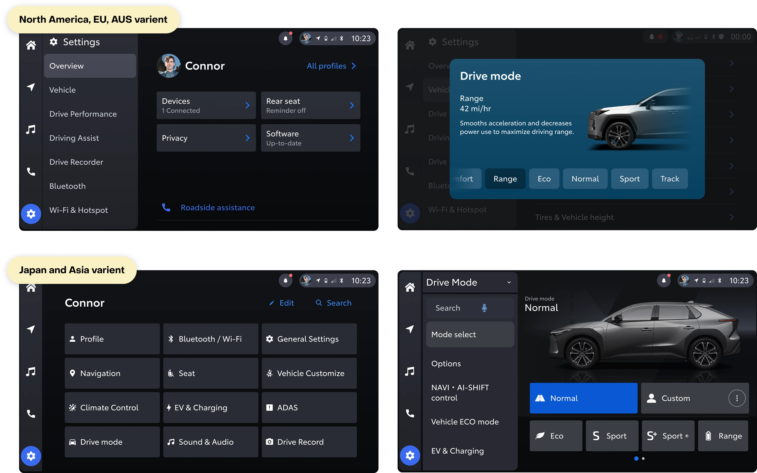
Rather than forcing a single global solution, we designed regionally appropriate architectures—list-based navigation for North America, Europe, and Australia, and grid-based patterns for Japan—aligned to each market’s mental models.
The work focused on simplifying hierarchy, clarifying nomenclature, and improving scan-ability to support fast, safe interaction in motion. We validated the approach through in-car usability testing, resulting in a more intuitive, scalable Settings experience that better supports global users.
"I want to continue to let you know what an amazing partnership this has been for us. You absolutely have gone above and beyond to do incredible work."
— Global Design Lead, Toyota
Toyota’s infotainment system supports a wide range of vehicle features, from safety to personalization. Over time, the Settings domain became increasingly unwieldy—buried in deep navigation and inconsistent category structure that made it hard for users to find and adjust key controls, especially while driving.
Meanwhile, Toyota’s next-generation system was being designed in Japan. Early reviews raised concerns that the emerging architecture, optimized for Japanese user expectations, would not translate well to North American, European, and Australian markets.
To address this, Toyota North America embedded me as the lead designer for the Settings experience in Western markets, with close collaboration across global product, design, research, engineering, and human factors teams.
Approach
We treated this as a large-scale information architecture and systems design challenge grounded in real-world use and cultural context.
As the lead designer for the Settings domain, I owned the architecture and core decisions while guiding a senior designer and coordinating globally.
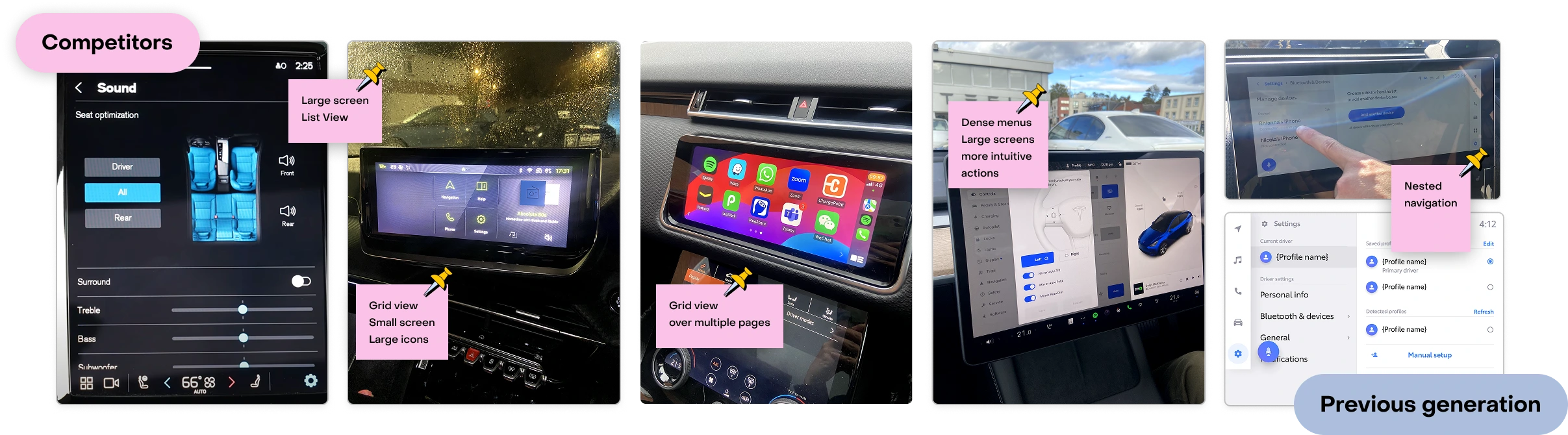
We started with a comprehensive audit of the current Settings domain, competitor patterns, and early Japanese
Outcome
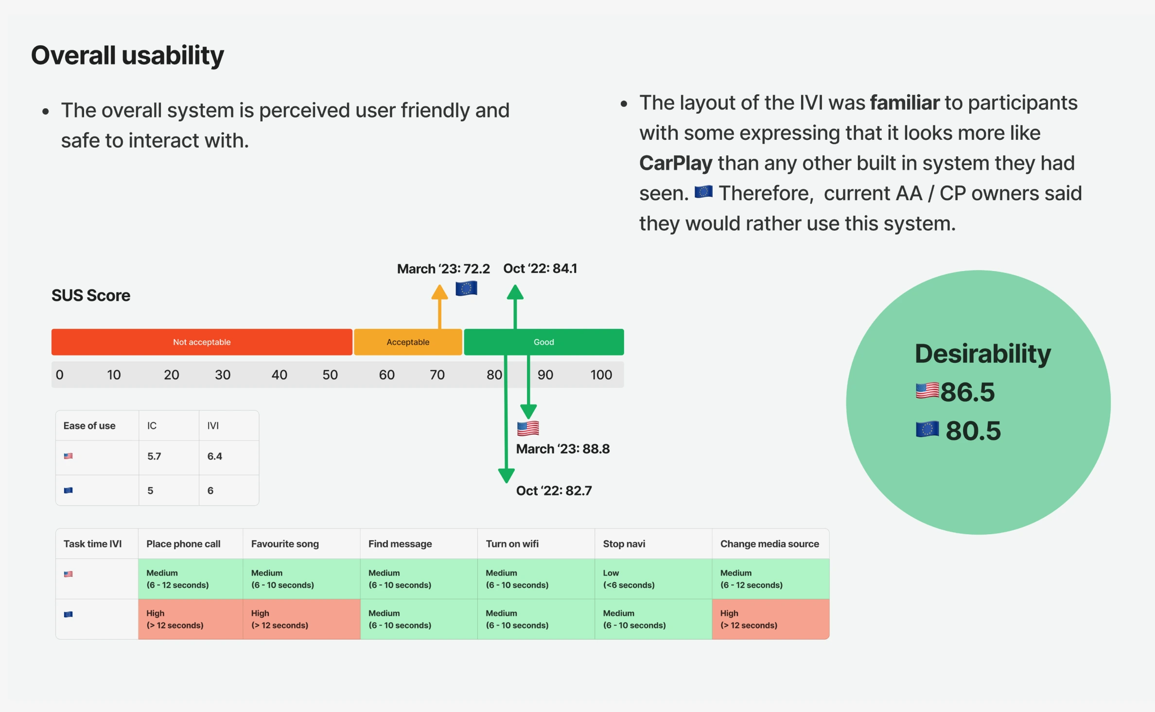
In partnership with Toyota’s research team, we conducted 12 one-on-one in-car usability sessions, observing behavior both parked and while driving.
The redesigned Settings domain:
Improved feature discoverability and reduced cognitive load
Aligned more closely with Western user expectations
Provided a scalable architecture ready for future growth
Strengthened alignment across regional and global teams
"I want to continue to let you know what an amazing partnership this has been for us. You absolutely have gone above and beyond to do incredible work."
— Global Design Lead, Toyota
Toyota’s infotainment system increasingly houses a wide range of vehicle controls and digital services. As new capabilities were added, the Settings domain grew to more than 100 configurable features—spanning everything from safety systems to comfort and connectivity. Users struggled to navigate this complexity, especially in the in-car context where speed and clarity matter.
At the same time, Toyota’s next-generation system was being developed in Japan. Early architecture reviews raised concerns that patterns optimized for one market wouldn’t translate well globally. Toyota North America brought me in to re-evaluate and redesign the Settings experience for Western markets while collaborating closely with global stakeholders.
The Problem
Users were slowed down by:
Inconsistent and overloaded categories
Deep nesting that obscured common options
Dense layouts that increased cognitive load
Terminology that didn’t match regional mental models
These issues were especially pronounced in motion, where drivers need fast, legible, and predictable interactions.
Design challenge: How might we redesign the Settings architecture to reduce friction, respect cultural differences, and help drivers quickly access what matters most?
Goals
Create an intuitive, scannable, and safe Settings experience
Align structure and language with Western expectations
Balance global coherence with regional usability
Design a scalable system that can grow with future features
Leadership & Collaboration
My role included:
Owning the information architecture strategy and major design decisions
Guiding and mentoring a senior designer
Partnering with North America design leadership
Coordinating closely with Japan-based product and design teams
Collaborating with research, human factors, engineering, and product
Aligning diverse stakeholders around user-centered decisions was a core part of the work.
Discovery & System Audit
We conducted a full audit of:
The existing Settings experience
Competitor infotainment systems
Early Japanese designs
The audit confirmed:
Poor discoverability and hierarchy issues
Western users gravitated toward list-based, text-first navigation
Japanese expectations favored grid-based, visually dense layouts
A single global design would not serve all users equally
These insights set the stage for a regionally adaptive architecture.
Using AI to Navigate Complexity
Given the scale of the domain, AI was used as a strategic thinking partner—not a design substitute.
AI exploration allowed us to:
Represent a range of driver perspectives
Surface potential edge cases early
Explore alternate information structures rapidly
This helped inform architectural decisions, while final solutions were always validated through research and usability testing.
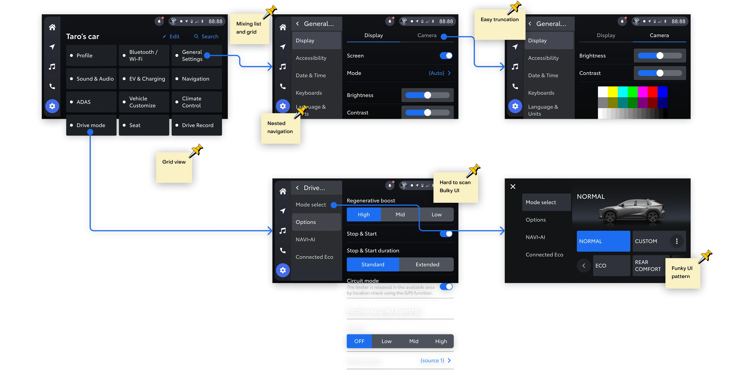
Strategic Decision: Regional Variants
A key decision was to design regionally tuned navigation:
North America, Europe, Australia: list-based navigation, shallow hierarchy, text-forward labels
Japan: grid-based navigation with localized visual organization
This respected regional mental models while preserving shared underlying logic.
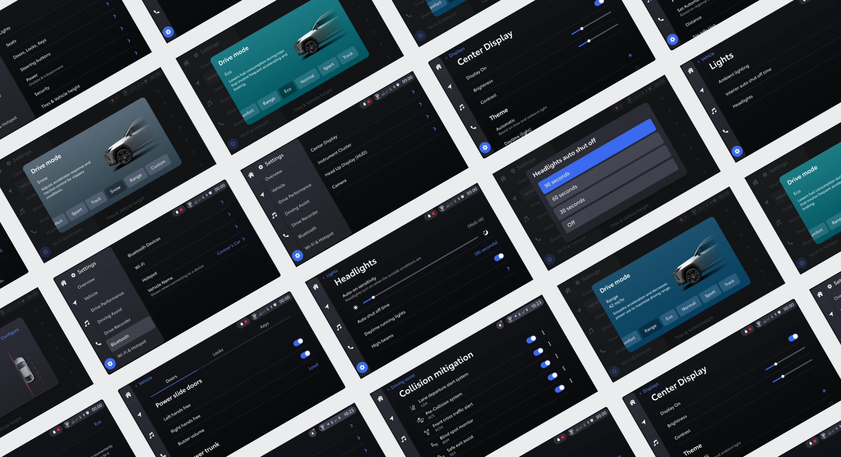
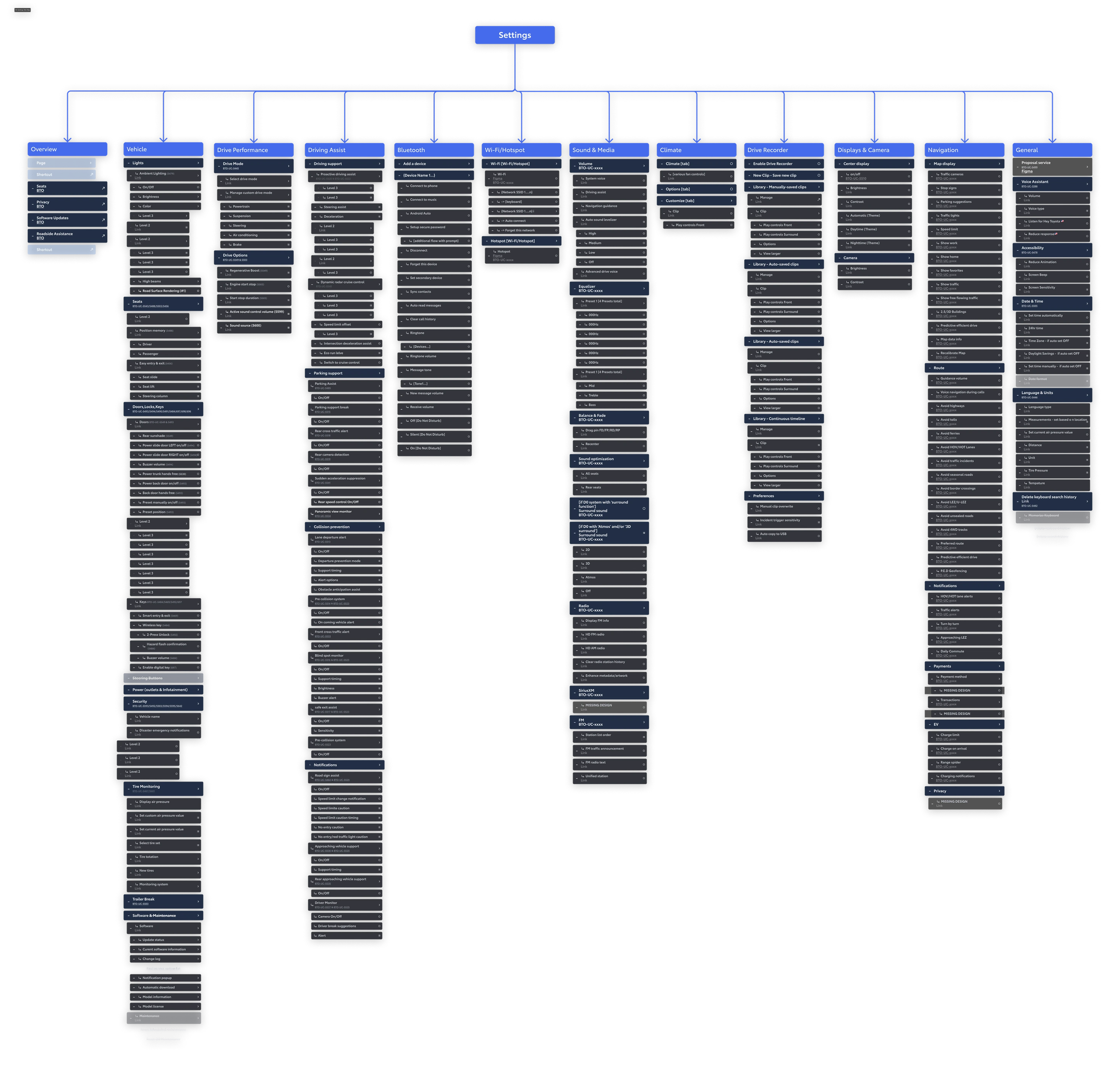
Designing for Clarity at Scale
To make a large domain usable:
We restructured top- and sub-level categories
Clarified nomenclature with supportive subtext
Improved scan-ability with clean lists and reduced noise
Added a Settings overview page for orientation and quick access
The focus was on speed, clarity, and confidence—especially while in motion.
Testing & Validation
In partnership with Toyota’s research team:
A detailed Figma prototype was built
12 in-car usability sessions were conducted with participants parked and driving
Observations informed refinements
Key outcomes included:
Improved feature discoverability and ease of use
Strong desirability and usability feedback
Minor nomenclature refinements based on observed confusion
Clearer paths to common tasks
Outcome
The redesigned Settings domain significantly improved usability for Western markets while respecting global system needs.
Reduced navigation friction and cognitive load
Aligned the experience with regional mental models
Delivered a scalable, future-proof architecture
Strengthened alignment across global teams
"I want to continue to let you know what an amazing partnership this has been for us. You absolutely have gone above and beyond to do incredible work."
— Global Design Lead, Toyota